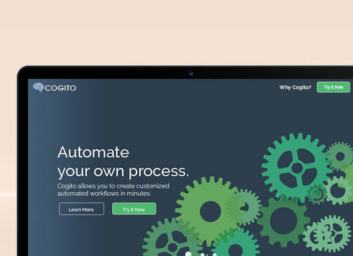
Cogito Mockup Version Two
Second Mock Up Design
This design is intended for the revamp of the Cogito website. It is an automation company. This is a compilation for Cogito Mockup Version Two.
The difference of Cogito mockup version two from the prior one is that it is shorter and no extravagant spacing was used. The color theme also sticks with contrasting colors.
As for the design, the first thing that comes to mind are gears. I used green as the accent color for this design. I made this design as short and minimal as possible. The plan however, was for it to have a lot of animations in the development stage.
Weblabs PH, 2015


